
Rising Shores is a 3D map of Singapore with one control that matters: a gauge that raises the sea. Drag it up and the water follows the real terrain into the island, buildings turn red where it reaches them, and the numbers underneath say how much land, how many buildings and roughly how many residents are affected.
Water has to be able to get there
Filling every cell below a given height, the bathtub approach, floods inland hollows that the sea could never reach. Instead the elevation model, Copernicus GLO-30 at 30 m, goes through a priority flood when the data is baked: each cell gets the lowest sea level at which water can actually flow in from the open sea. In the browser, the gauge is compared against that one number per cell, and a water shader draws the result over the satellite imagery.
123,000 buildings, each with its own threshold
Every footprint comes from OpenStreetMap, with heights from OSM tags and the 3D-GloBFP dataset. Each one takes the lowest flood threshold found under its outline, so a building turns red as soon as the water touches any part of its base. Detailed rooftops are drawn by a separate three.js layer, and MRT stations, schools and places of worship are tracked the same way.


Floodwater is not the sea
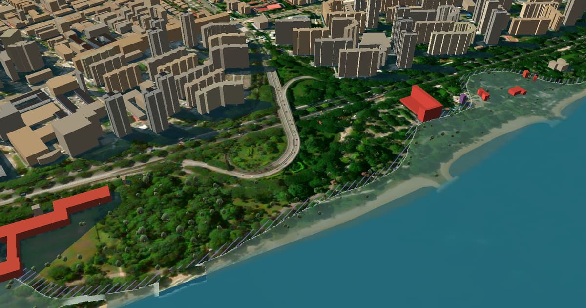
Drowned land gets its own water: shallower, murkier and see-through near the edge, so the streets and the beach still show underneath, with a thin bright line where the flood meets dry ground. The open sea keeps its whitecaps, the reservoirs and Marina Bay stay calm, and the reflections follow the real camera angle and the scene's sun.
Drawing what the data cannot say
A 30 m satellite surface model has a vertical error of around a metre, so the map draws that margin instead of leaving it to a footnote. Ground within 0.75 m of the waterline is hatched, the buildings standing on it turn violet before they turn red, and the address check quotes the same margin.
It models no sea walls, barrages or drains. It shows what Singapore's coastal-protection programme exists to prevent, not a forecast of what will happen.
Years, not just metres
Nobody has an intuition for "+1.3 m", so a scenario picker turns the gauge into years: three emissions pathways to 2150 from Singapore's Third National Climate Change Study, Ng et al. (2025) and the IPCC's Sixth Assessment Report, with an optional storm surge on top. Play runs a pathway from 2025 to 2150 while the camera flies over the waterfront, and Compare lays today's view over the risen one with a divider you drag. The projections, what floods first and how Singapore is preparing are written up in a companion page, Rising sea levels in Singapore.
What it runs on
- Rendering
- MapLibre GL v5, three.js, custom GLSL water
- Data
- ~15 MB baked ahead of time from open sources
- Serving
- one Cloudflare Worker, static assets
- Analytics
- D1, cookie-less, a salted hash instead of an IP
Everything the map draws is prepared offline and shipped as static files, so there is no tile server and no database between a visitor and the flood.